
Amobee Campaign Portfolio Management
Introduction/Overview
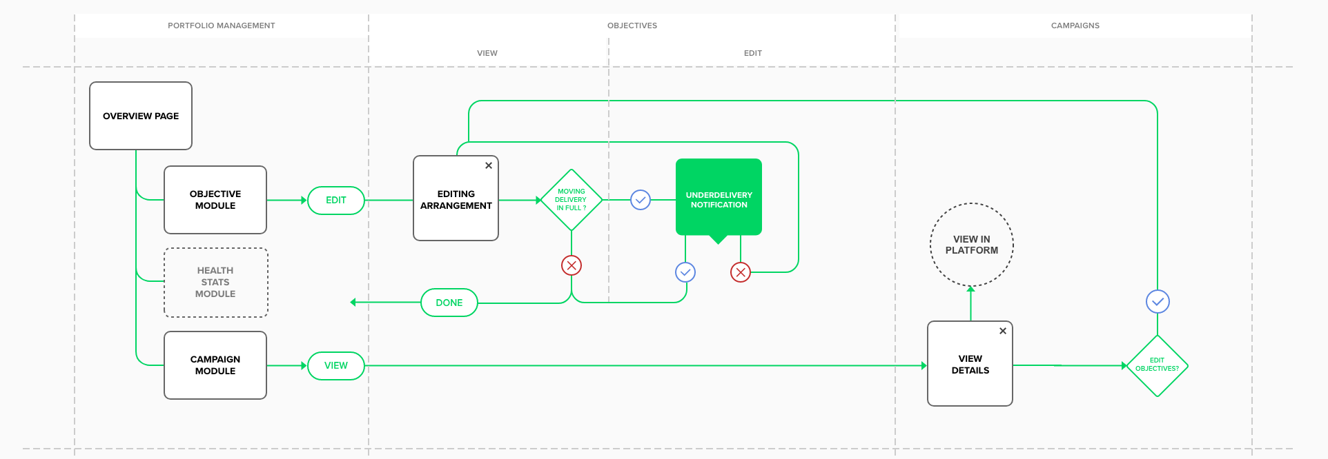
The Amobee Campaign Management project focused on improving the Portfolio Management tool, which allows users to monitor campaign and deal delivery. The existing tool had been introduced to the platform several years prior, and users expressed that it was difficult to use and provided a poor experience. My role included UX Research, Prototyping, Art Direction, and UI Design. The goal of this refresh was to improve the user experience by displaying useful data that would enable users to make faster, more informed decisions.

Original Design for Portfolio Management
The redesign aimed to enable users to:
Prioritize campaigns when supply is limited.
Customize objectives at the campaign level.
Gain visibility into backend controls affecting placement delivery.
Set allocation goals and define/prioritize demand groups.
Improve allocation of guaranteed broadcast inventory.
Visualize portfolio allocation and delivery against goals.
Prioritize all portfolio goals, including margin and group control.
The Problem
Users had expressed predominantly negative opinions about the existing Portfolio Management tool, citing poor usability and overall experience. The tool did not effectively empower users to manage their portfolios or gain necessary insights. There was a need to provide users with the ability to quickly make decisions


The Process
The research and design process involved the following:
Site Audit
Sketching & Paper Prototypes
User interviews
User tests: Each session lasted 30 minutes and included a briefing, interview, task performance (viewing objective status, prioritizing campaigns, and prioritizing campaign objectives), and debriefing.
Goals:
Identify the strengths and weaknesses of the updated Portfolio Management design.
Provide opportunities for improvement.
Gain insight into how objectives affect typical workflows and optimal interaction methods.
A key challenge was the additional requirement to deliver a stop-gap refresh of the current design within a 2-week timeframe, with only one developer.
Concept Images:


The design process involved showing initial sketches to users, which revealed that they wanted to leverage the page in more ways and wanted it to do more. The concepts evolved into a dashboard-like view, reflecting how users integrated the existing implementation into their workflow and utilized the data in conjunction with other parts of the platform.
Tools used included: Sketching, Paper Prototypes, Adobe XD, After Effects, and InVision.

MVP Design created with a single developer in a short period of time
The Solution
The redesign of the Portfolio Management page evolved into a dashboard-like interface, driven by user feedback on how they integrated the tool into their workflows. Key design solutions included:

Final Page Design

Final Editing Objectives Design

Alternative Final Page Design
Main Page: The evolution of the main Portfolio Management page that it became more dashboard like, this was a result of the them telling us how they fit the current implementation into their current workflow and how they leverage the data it provides along with other parts of the platform.
Viewing and Editing Priorities: Platform priorities were made more visible, displaying at least the top 5 priorities. This enabled users to understand platform goals and default campaign goals.
Viewing Campaign Details: The campaign list and details were designed to provide users with insights into campaign performance issues and allow for objective adjustments.
Bulk Editing: A bulk editing feature was introduced to facilitate common daily actions, such as editing campaign priorities or setting custom objectives for groups of campaigns.
Empty/Default States: Empty states were designed to add personality and a positive user experience to potentially mundane workflows.
Metrics and Results
The redesign resulted in a Portfolio Management page that was more dashboard-like, reflecting user feedback on their workflows and data needs across the platform.
Lessons Learned
Redesigning an interface with an existing user base whose needs weren’t being met should always begin with getting access to full analytics. Spending enough time to extract all possible insights from that data is very important.